photo backgold.jpgphoto old Everton badgephoto next button.png

 photo loveevertonproboards_zps3ad65382.png

New Everton Crest Rejected By Fans


In May 2013, Everton decided to update the Everton Crest, to a more modern, scalable design, but things didn't go to plan, and the fans rejected the change. This is what Everton had to say at the time:

The new, more modern, cleaner and dynamic design has been created following an extensive consultation process with fans, supporters' groups and branding experts.

It combines four historic elements of the previous badge - the Tower, the shield, our name and the year of our formation - to form a concise, modern and dynamic representation of Everton.

From the very outset of a process which began in Autumn 2012, the Club’s in-house design team talked to fans about our Crest, its significance, its meaning and the importance of the individual components.

The project team received feedback on initial concepts from the Club’s Fans’ Forum – a representative group of Evertonians including Season Ticket Holders, Suporters’ Club officials, Corporate Members, Shareholders and fans from the Everton Disabled Supporters Association. The Forum gave honest and candid feedback and suggested changes which, where appropriate, were integrated.

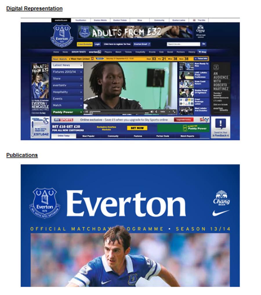
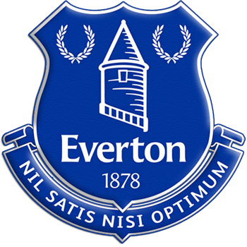
The updated Crest now boasts a more realistic version of the famous ‘Everton Tower’ as its centrepiece and the modernised design prominently features the Everton name. Its simplified nature means it can be reproduced more effectively in the digital and retail arenas.

The previous Crest - introduced 13 years ago - is frequently misrepresented, has become increasingly difficult to reproduce in the digital age and often suffers from having key elements removed such as those ‘outside of the shield’, namely; Everton, 1878 and Nil Satis Nisi Optimum. It has also proved complex to replicate accurately on a number of retail ranges and other materials resulting in a myriad of different colours and designs.

The name Everton and the 1878 date have been incorporated into the shield which does not feature the Latin motto. Although 'Nil Satis Nisi Optimum' is not included in this new design, it will still have a high-profile presence throughout the Club, and a new range of retail products are being introduced with the prominent use of the Latin motto.

The first official Crest to feature on a Club kit dates back almost 100 years to 1920. In those days it comprised the white letters ‘EFC’ entwined upon a blue shield. Since 1920, nine different versions of the Crest have adorned our famous royal blue jersey.

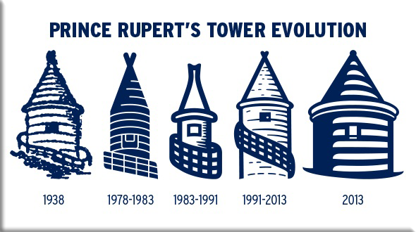
This new design has used Theo Kelly’s classic 1938 version as its inspiration.

Source: Evertonfc.com


photo new everton badge compared to old theo kellyimage_zpsef71953d.png

photo princerupertstowerevolution


Our work started with a thorough research process carried out by a development team from within the Club. Their work delved into the history of the Everton Crest and examined the successes enjoyed by other clubs which have updated their own crests.

Our royal blue jersey has carried nine previous versions of the Crest, with a variety of elements being used and then discarded to form the badge of a previous era.

The one element that has been most consistent in all Crests down the years is the famous Tower.

Everton’s Creative Manager, Nigel Payne, led the internal design team on the project. He said: "As a key part of our research we looked at what it was to be an Evertonian and what it is to be Everton.

“Everton is a unique community-based club – The People’s Club - which is why we wanted to keep the process in-house and within the Everton family. External agencies just wouldn’t have that knowledge; wouldn’t have that affinity.

“The initial work started on firm foundations. There is a wealth of knowledge of Everton – our heritage, our values, our principles - within our team.”

The designers looked closely at the evolution of Everton’s Crest as part of their research.

Graphic designer, Mark Derbyshire, added: “We looked back at the history of the Crests and the one we focused on predominantly was the 1938 Theo Kelly design which was originally used for neck-ties but which has become the blueprint for the modern era.

"Interestingly, the key elements from that design didn’t feature on the shirt until 1978 – in the six years before that there was just simple embroidering of the letters ‘EFC’ on the jerseys - and plain blue jerseys before that going back to the early 1930s."

Commercial Director, Dave Biggar, explains that Everton’s past was always going to form the basis for its future as part of the evolution of the Crest.

"You can’t ignore that; you can never ignore this Club’s history,” he said. "The Tower is a fundamental part of previous Club Crests as well as our new version. But we really wanted to put a more authentic version of the Tower onto the Crest."

The depiction of the Tower on this latest evolution is different to that which has been on the shirt in recent years but is actually much more accurate in terms of dimensions and structure.

Dave continued: "What we have now is a more honest and accurate reproduction of what the Tower is."

Nigel added: "We looked at lots of different designs, as you can imagine. Not just for the Tower but for the fonts, the shield shape – everything that needed to be brought together.

"It was a real balancing act getting all the elements together and making them work as a whole entity rather than individual pieces. And throughout the process we felt the weight of history and being respectful to that history – and that original version of the Crest."

Mark added: "The Tower is, quite rightly, the standout element on most of the Crests so we made that the focal point. We looked at old photographs, old illustrations of the Tower and took photographs of it as it is today from all angles. We looked at how we could bring it to life more. We wanted to emulate the original Theo Kelly design - but with a modern twist."

That meant removing the element from recent versions of the Crest that has been referred to, in some quarters, as ‘the helter-skelter’. Several versions of the Crest have stretched the Tower - in doing so, the bars that were originally intended by Theo Kelly to reflect a fence that once surrounded the Tower have been pulled to form something more akin to a sash.

One of the key findings from the months of research and planning was the aspiration to deliver a more authentic, accurate Tower that would form the heart of the new, more modern Crest.

Source: evertonfc.com


The Iconic Everton tower

Artwork of  Prince Ruperts Tower

photo stanley herdman browside loveevertonforum


Alas, despite Everton's efforts to create a new crest, a change of plan soon followed, as simply put, too many fans didn't like the design.

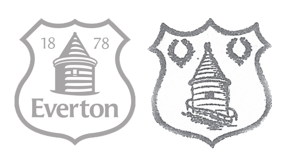
Everton were accused of betraying their traditions with the "embarrassing" new badge as it omitted two key features from the club secretary Theo Kelly's original 1938 design – two laurel wreaths that represent the Olympian sign of success, and the club's Latin motto "Nil Satis Nisi Optimum", which translates as "nothing but the best is good enough".

The laurel wreaths had been replaced by the date of Everton's formation, 1878, and the club's name had been brought into the shield. The Everton landmark, Prince Rupert's Tower, which features in the crest, had been redesigned to be more accurate.

The timing of the unpopular badge also came at a time when their manager of 11 years, David Moyes, had departed, and eventually the new manager, Roberto Martinez had the job of presenting options for a new design.

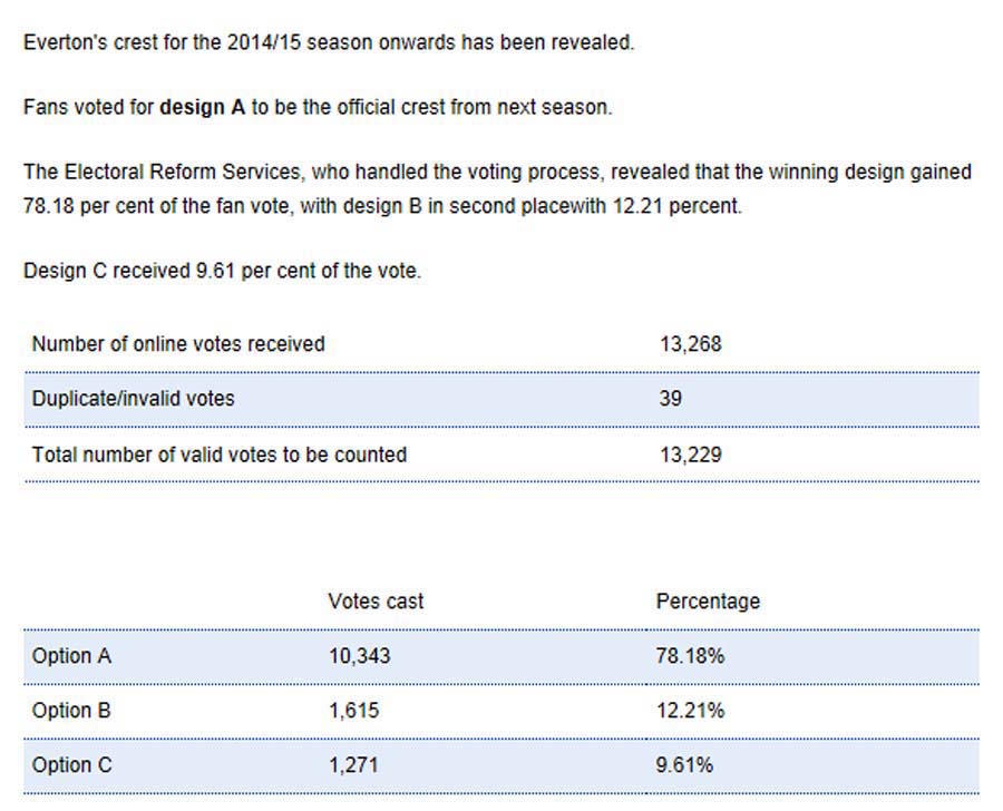
Fans were offered 3 alternatives in which to choose from.


Three crest designs for fans to choose from

Roberto Martinez unveils the new Everton Crest

Roberto Martinez unveils the new Everton Crest

image everton crest article image everton crest article image everton crest article image everton crest article image everton crest article image everton crest article

image of everton crest

photo backgold.jpg  photo twitterloveevertonforum.png photo next button.png